With how fast the world is moving today, more and more customers are expecting service in a flash. That’s why it’s vital your mobile website’s page loading speed is at its very best. There is simply no excuse for a slow-loading website nowadays, and customers will quickly lose their patience with you. Why stick around and wait for a website to load when there are faster-loading websites elsewhere?
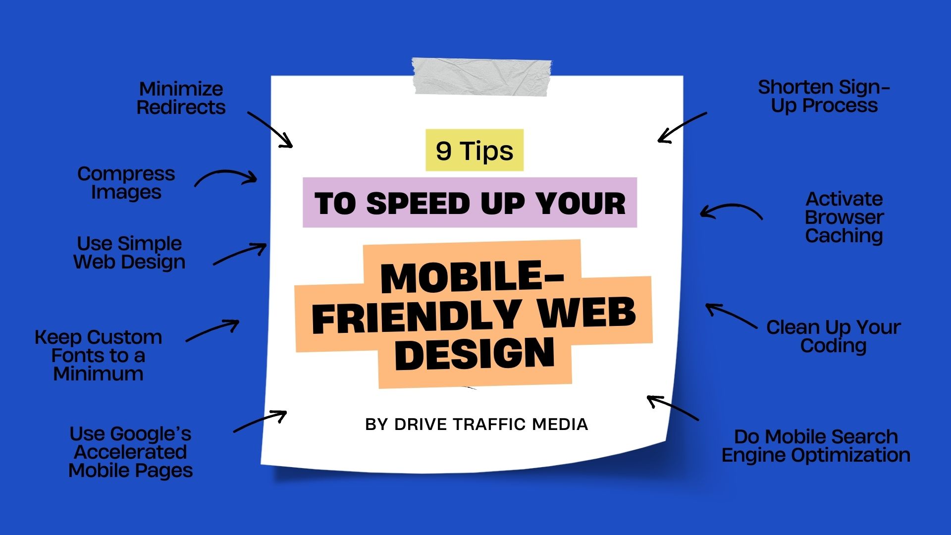
Here are the 9 best ways to speed up your mobile website’s loading speed, according to an Orange County web design company.
Minimize Redirects
Redirecting is when you send a user to a different page than what the link originally directed to. This can happen in many ways, the most common of which is page deletion—instead of having the user end up on a 404 page, you redirect them to another page on your website.
Having too many of these redirects slows down your page loading speed. Essentially, you’re loading multiple pages instead of just one, which increases your bounce rate. If your bounce rate is too high, you start losing customers and falling down the ranks of search engines.
Compress Images
You’ll want to compress your images as having large images can take forever to load. In addition to that, it’s just unwise to have large images as it’ll be difficult to load them properly on mobile, anyway. So, if you insist on having images on your mobile-friendly website, make the file size as small as possible and have them fit on mobile devices.
You should also consider using as few images as possible or not using any large images at all besides your logo, product photos, and other essential images.
Use Simple Web Design in Orange County
You might be tempted to add as much as you can to your website design, but keep in mind that having too many frills will affect your page loading speed, especially on mobile! You should have a minimalist design as much as possible since it not only lets your customers find what they need easily but it also doesn’t take a lot of power to load.
If you really want a heavy web design, consider using it only for the desktop version and having a simpler design for mobile.
Keep Custom Fonts to a Minimum
Custom fonts might look pretty and unique, but they can really bring your page down. That’s because it takes a lot of work for them to show up on all computers. Unless the font you’re using is universal (e.g., Arial, Verdana), then not everybody will have them downloaded on their computers, making you require extra CSS or Javascript coding to have them present properly.
Like images, you don’t need to avoid custom fonts altogether. Limit custom fonts to headers, logos, and other important tidbits of information rather than using them for the whole website.
Use Google’s Accelerated Mobile Pages
Google is a pretty cool dude. They just want what’s best for you and your website, which is why they frequently come up with awesome tools and programs to improve your website. One of these programs is Accelerated Mobile Pages (AMP), which helps you clean up your code, so everything loads four times faster than standard web pages!
Shorten Sign-Up Process
Navigating through a mobile website is already tough enough with all the scrolling and tapping and zooming you need to do. You don’t want to make things harder for your customer by having a multi-page sign-up process!
So, if your website requires you to sign up for an account, make sure the process takes as little as possible. This gets rid of unnecessary coding and makes signing up quicker and easier for your users. Remember, the more hoops your customers have to jump through, the quicker they’ll tire of you.
Activate Browser Caching
Browser caching lets your computer remember certain things it’s inputted on a website. For example, it can load up products you’ve already searched for in previous visits, remember passwords you’ve signed up with, and pull up credit cards you’ve used before. This helps websites load much faster since everything’s already there.
Orange County web designers highly recommend enabling browser caching!
Clean Up Your Coding
As website designers in Orange County ourselves, we know how dirty things can get when we’re coding. There’s a lot of trial and error involved, and sometimes we can get carried away and make a mess of things on the back-end. Instead of going from Point A to B, we’re going from Point A to E to C to D, then finally B!
However, it’s still important to clean things up after we’re done. Spaghetti code is still code at the end of the day, and that takes precious microseconds away from your page loading speed. Have an expert look at your code and remove anything unnecessary.
Do Mobile Search Engine Optimization
If the eight previous sections were not enough to convince you of the benefits of mobile-first design, then this section definitely will. Simply put, you need to prioritize mobile-first design because Google says so, and woe betide you if you choose to ignore them!
The less mobile-friendly your website is, the lower you will rank on Google’s search engines. This has been confirmed multiple times by the higher-ups at Google. With lower rankings come lower visibility, which in turn translates to lower sales and conversions. What’s the point of having an awesome desktop website and awesome products and services if nobody is there to see it, right?
Conclusion
Having a fully-functional mobile-friendly website is super important for your business. At Drive Traffic Media, we offer Orange County web development services that ensure your website is up-to-speed with the latest trends and policies. Contact us today at (949) 401-6008 to find out more about our various services and also get a free quote and consultation.