As the Greek philosopher, Heraclitus once said, “The only constant in this world is change.” This applies to a variety of things including logos!
Things go in and out of fashion all the time, and if your logo fails to keep up with the current trends you risk looking outdated and unremarkable. In the marketing world, your logo needs to have that oomph to really stand out. So, whether you’re a new business owner looking to create a new logo or an established one looking for a revamp, it’s important to look at the trends to create a logo that’s built to last.
Here are the top trends in logo-making today.
1. Gradients
![]()
Gradients are designs featuring colors blending into other colors. You can add any colors to a gradient, but make sure the transition is smooth, cohesive, and fluid. For example, a gradient from light pink to light green would probably have a lot of brown-looking colors in the middle.
Gradients are a great way to enhance your logo. As you can see here, Instagram cleverly uses a rainbow gradient on theirs to emphasize their white camera icon!
2. 3D Effects
![]()
3D effects add dimension and perspective to your logo. When used correctly with proper shading and blurring techniques, it can make a logo pop out of the screen.
Just remember that 3D effects don’t work on everything. If your business is mostly online, then a 3D logo would probably work as it renders well on the screen. However, if your products are mostly physical (e.g., t-shirts, mugs, etc.) then the coolness of the 3D effect can easily get lost.
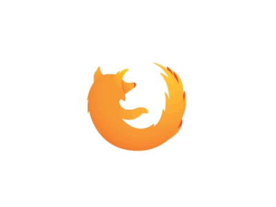
3. Animation
Animations help a static logo come to life! They’re a great way of adding fun and quirky storytelling to your brand. It also allows for more originality from brands that want a creative edge over their competitors.
Always be considerate of your customers. Chances are, they won’t have the time or patience to watch a 1-minute animation of your logo. You’ve only got a few seconds for your animation so make it count.
Also, be mindful of how the animation fits into your brand. If it does nothing but distract customers from your logo, it’s better to just keep it out.
Take a look at this animated Firefox logo, for example. Here, we see how a simple rotation enhances the quick loading speed Firefox has!
4. Nostalgia
![]()
People love to bring up the past. Retro styles have been reemerging with modern twists as of late, and that applies to logos too! If your brand is involved with anything that invokes a sense of longing for the past, or if you just want something different from the sleek and modern designs of today, then perhaps a nostalgic design is for you.
In 2016, K-pop group Shinee released a new jack swing song called “1 of 1”. They aptly changed their logo to fit the 90s vibe here:
5. Monochrome
![]()
Sometimes the simplest and cleanest designs are the best. No frills, no fuss—it’s like bragging that you don’t need a fancy logo to lure in the customers!
6. Hand-Drawn or Hand-Written Elements
![]()
These types of logos are one-in-a-kind because they were specifically drawn for your brand! It adds a personal touch and injects individuality, making it more accessible and relatable to your customers. It sends a message that you’ve invested your heart and soul into making your brand what it is today.
7. Brush Strokes
We don’t know what it is about brush strokes, but they look very graceful, elegant, and powerful. Like hand-written or hand-drawn elements, they add a touch of realness to your logo and make it look more personalized.
Brushstrokes are also very versatile! You can add them to your typography or the design. You can use pale watercolors or bold oil paints. There’s a lot you can do with brush strokes!
In this example, we see how James Charles cleverly uses brush strokes to spell out his name and reveal a stunning makeup look.
![]()
8. Layers
Adding layers to your logo is another great way of enhancing it. Like 3D effects, it adds depth—it makes your customers look extra close to see all the elements.
![]()
Take the NASA logo for example. According to their website, the circular shape represents a planet, the stars space, the red wing aeronautics, and the orbit space travel. These elements are tastefully layered together to create a logo that signifies NASA’s vision-mission perfectly.
9. Typography
You can do a lot of things with the right typography. You can experiment with different typefaces—bold or thin, tall or short, serif or sans-serif, and so much more. You can convey a lot of messages by simply choosing the right font.
![]()
Let’s take a look at Sony’s Vaio logo. It spells out Vaio, obviously. But, it also hides a message: the first two letters represent a sine wave, which is the basic analog signal, while the last two letters look like a 1 and 0, the two symbols of the binary code.
10. Black and White
![]()
Black and white logos are timeless classics. Surprisingly, it is also very versatile. You can use positive and negative space, create silhouettes and shadows, add in hidden messages and images, and so much more. When done properly, it can make a huge impact!
Conclusion
Do you need help crafting a logo that’s in with the times? Or a logo that represents your business well? We can help you with that. Drive Traffic Media is a digital marketing company and web design company with logo design experience. Contact us at info@drivetrafficmedia.com or at (310)341-3939 today.
![]()